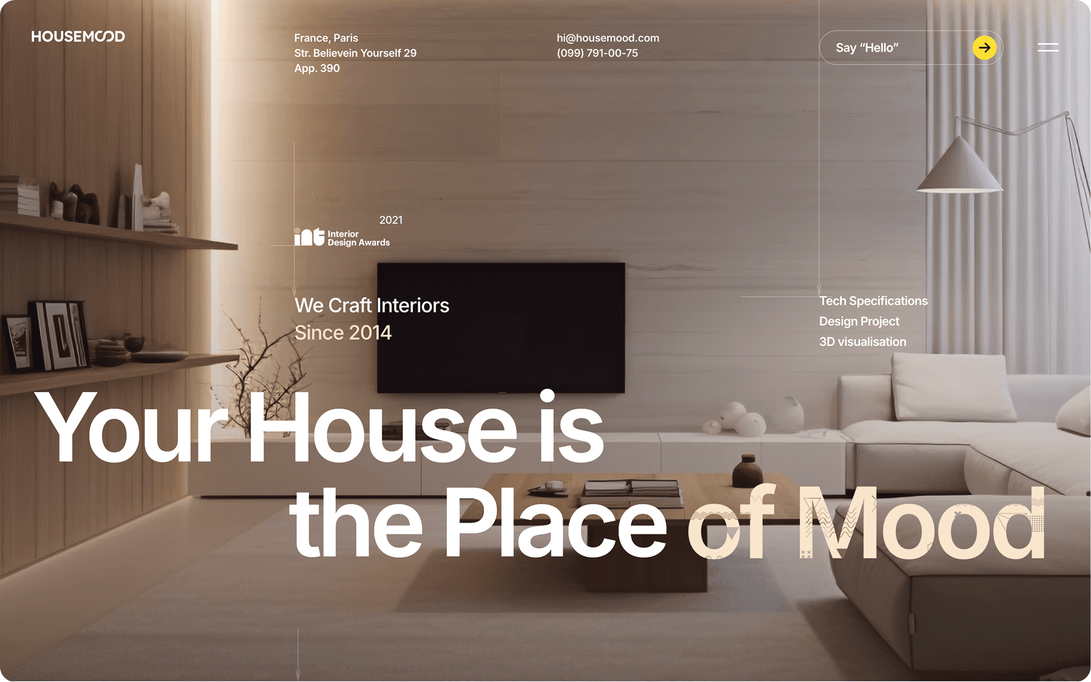
What visitors decide in fifty milliseconds.
Before anyone reads a word, they have judged whether your business looks credible. The research has said so for twenty years.

In 2006, a team at Carleton University in Ottawa showed people web pages for fifty milliseconds — a twentieth of a second, shorter than a blink — and asked them how appealing each one was. The same pages were shown for half a second, too. The two sets of ratings agreed closely: whatever people decided at a glance, ten times longer to look barely changed it.
What the eye takes in
Fifty milliseconds is not long enough to read. It is long enough to see: contrast, balance, the weight of the type, how much space there is and how it’s used, the quality of an image, whether things line up. The verdict comes from the whole page at once, not from any one part of it — which is why one strong photograph rarely rescues a crowded page.
Beauty gets credit it hasn’t earned
A century ago, the psychologist Edward Thorndike noticed that officers rating their soldiers could not keep their judgments apart: a man rated well on one quality tended to be rated well on all the others. He called it the halo effect. It has turned up in many kinds of judgment since — including judgments of screens.
In 2000, researchers at Ben-Gurion University asked people to rate layouts for a cash machine. The layouts people found more beautiful, they also expected to be easier to use — and after using them, they still rated the beautiful ones as easier. Three years later, a Stanford study asked more than 2,500 people how they decided whether a website was credible. The thing they mentioned most, in nearly half of all their comments, was how the site looked.
Visitors judge the whole page at once. Nobody reads their way out of a first impression.
It isn’t shallow. It’s efficient.
None of this means visitors are careless. Nobody can check a business before deciding whether to read its website, so people use the cues they can check — and the care visible in a site is one of them. A business that took trouble over the part you can see is assumed to take trouble over the part you can’t. That’s not an unreasonable bet. The halo is only unfair to businesses whose sites look worse than their work.
What it means for a website
- The first screen does the deciding. It should say one thing — one image, type that holds — before anything asks to be read.
- Quality shows before content does. Alignment, spacing and type that stays consistent are seen at a glance. So is their absence.
- A blank screen is a first impression too. If the page is still loading at fifty milliseconds, the visitor is judging the wait.
- Don’t spend the first half second asking. A pop-up or a chat window that arrives before the page has said anything is the first thing judged.
Half a second. That’s all anyone gets — and most of it is spent before the reading starts.